Dealing with Dialogs in Svelte
Controlling modals with Svelte 5
Contents
Introduction
Modal inputs are everywhere because they are just such a convenient and useful building block for UX design. They are perfect when we want to capture a limited amount of information from the user, but avoid taking them elsewhere within the app - it’s clear the context they are in, we just get another overlay to use to prompt them for what we need.
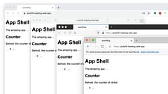
But exactly how to do that can sometimes be a challenge. So we’ll explore some approaches that you can use when you need to control a dialog using Svelte 5. Here’s a short video (no sound) showing the type of things we’ll be building:
Types of Modal Dialogs
For me, there are two main types of modal dialog:
Alerts and Confirmations
Sometimes, you just need to tell someone something and have them acknowledge that they have seen it. It’s a popup with a message and nothing they can really do but say “erm, OK then …”. An example is “Your battery is getting low”, maybe there isn’t much you can do but it’s good to be alerted. Sometimes there may be some options, such as “Your battery is getting low, would you like to enable power saving mode?” with options to “Enable” or “Cancel”. Simple inputs. They are also often used for confirmations to check that you really want to do the thing you just said you wanted to do, e.g. “Are you sure you want to delete this entry? It will be gone for goood!” and options to “Delete” or “Cancel”. This type of UX can become very tiresome to use and it’s usually a much nicer experience to provide undo functionality - these can be via small toast notifications that automatically dismiss after a period of time, so don’t interrupt the users flow as much. You can also bake true “undo” functionality into your app, or just postpone the real action until the toast timeout expires without the undo option (really ‘cancel’) being activated.
Contextual Input Forms
When you need to capture more information than will conveniently fit on the screen, especially if it’s optional inputs where data may already exist but there is a chance they might need to edit it as part of some other workflow, a modal dialog with a form input can be ideal. An example of this is creating an order - the existing address from previous orders can be displayed, and chances are it doesn’t need to change so it would be a waste to display the full edit form (and risk accidental edits), but if it does need to be changed a click on an “edit” option can bring up the form to do so and return them to where they were in the other process afterwards. Another variation on this is where you have lists of data, and showing the full edit form for each entry would be tedious to navigate (especially for accessibility), but each row can provide an “edit” option to bring up the form, and the users place in the list is easily maintained vs if they have to navigate to another page to edit the item (or even worse, navigate to a view item detail page and then have to switch into some edit mode).
Implementation
We’ll go through implementation, building up a set of re-usable components within our app.
Reusable Modal Dialog
We’ll begin with the basic modal dialog. Whether you use the native HTML <dialog> element or you care about how your dialog looks and animates for all browser users, it’s useful to create a single component for the basic task of managing it. This will be what you use to open and close any modal dialog within your app and reusing it makes it easier to have consitent implementation and styling throughout. Here’s an example using svelte-headlessui (shameless plug …)
/lib/Modal.svelte
<script lang="ts">
import type { Snippet } from 'svelte'
import { createDialog } from 'svelte-headlessui'
import Transition from 'svelte-transition'
interface Props {
children: Snippet
commands: Snippet
onclose: () => void
}
let { children, commands, onclose }: Props = $props()
const dialog = createDialog()
// functions allow opening and closing the dialog from the host element
export function open() {
dialog.open()
}
export function close() {
dialog.close()
}
</script>
<!-- the unmount option completely removes DOM nodes from the page -->
<Transition show="{$dialog.expanded}" unmount>
<div class="z-10">
<Transition
enter="ease-out duration-300"
enterFrom="opacity-0"
enterTo="opacity-100"
leave="ease-in duration-200"
leaveFrom="opacity-100"
leaveTo="opacity-0"
>
<button class="fixed inset-0 bg-gray-500 bg-opacity-75 transition-opacity" onclick="{close}"></button>
</Transition>
<div class="fixed inset-0 z-10 w-screen overflow-y-auto">
<div class="flex min-h-full items-end justify-center p-4 text-center sm:items-center sm:p-0">
<Transition
enter="ease-out duration-300"
enterFrom="opacity-0 translate-y-4 sm:translate-y-0 sm:scale-95"
enterTo="opacity-100 translate-y-0 sm:scale-100"
leave="ease-in duration-200"
leaveFrom="opacity-100 translate-y-0 sm:scale-100"
leaveTo="opacity-0 translate-y-4 sm:translate-y-0 sm:scale-95"
>
<div
class="relative transform overflow-hidden rounded-lg bg-white text-left shadow-xl transition-all sm:my-8 sm:w-full sm:max-w-lg"
use:dialog.modal
{onclose}
>
<div class="bg-white px-4 pb-4 pt-5 sm:p-6 sm:pb-4">{@render children()}</div>
<div class="bg-gray-50 px-4 py-3 sm:flex sm:flex-row-reverse sm:px-6">{@render commands()}</div>
</div>
</Transition>
</div>
</div>
</div>
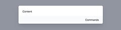
</Transition>Here’s the most basic use of it:
<script lang="ts">
  import Modal from '$lib/Modal.svelte'

  let modal: Modal
</script>

<button onclick={() => modal.open()}>Open</button>

<Modal bind:this={modal} onclose={() => {}}>
  Content
  {#snippet commands()}
    Commands
  {/snippet}
</Modal>
Which produces this gloriously basic result (but hey, it animates in and out nicely!)
Of course this is just a foundation that we will build other things on top of …
Alerts and Confirmations
Lets start with the simplest option, alerts and confirmations. What makes these simpler is not just that the result is usually just a true or false, but the control itself is usually a singleton. So we can interact with the component itself using the usual system of data bindings and events.
As with the basic modal, we want something re-usable, so we’ll create a Prompt.svelte component that will handle any type of simple prompt - something that we can pass in a title and description, an icon, a label for the confirmation button plus the classes to style it, and a callback for the results.
/lib/Prompt.svelte
<script lang="ts">
  import Modal from './Modal.svelte'
  import type { Snippet } from 'svelte'

  interface Props {
    title: string
    description: string
    label: string
    labelColor: string
    children: Snippet
    onresult: (result: boolean) => void
  }

  let { title, description, label, labelColor, children, onresult }: Props = $props()

  let modal: Modal

  export function open() {
    modal.open()
  }

  // ensure the dialog is closed and return the result
  function close(result: boolean) {
    modal.close()
    onresult(result)
  }
</script>

<Modal bind:this={modal} onclose={() => onresult(false)}>
  <div class="sm:flex sm:items-start">
    {#if children}
      {@render children()}
    {/if}
    <div class="mt-3 text-center sm:ml-4 sm:mt-0 sm:text-left">
      <h3 class="text-base font-semibold leading-6 text-gray-900" id="modal-title">{title}</h3>
      <div class="mt-2">
        <p class="text-sm text-gray-500">
          {description}
        </p>
      </div>
    </div>
  </div>

  {#snippet commands()}
    <button
      type="button"
      class="inline-flex w-full justify-center rounded-md px-3 py-2 text-sm font-semibold text-white shadow-sm sm:ml-3 sm:w-auto {labelColor}"
      onclick={() => close(true)}
    >
      {label}
    </button>

    <button
      type="button"
      class="mt-3 inline-flex w-full justify-center rounded-md bg-white px-3 py-2 text-sm font-semibold text-gray-900 shadow-sm ring-1 ring-inset ring-gray-300 hover:bg-gray-50 sm:mt-0 sm:w-auto"
      onclick={() => close(false)}
    >
      Cancel
    </button>
  {/snippet}
</Modal>
We can use this for different but consistent looking prompts. As a warning:

Or a confirmation prompt:

Here is the example code to render each one, plus code to trigger the modals and show / clear the results:
<script lang="ts">
  import Prompt from '$lib/Prompt.svelte'
  import { fade } from 'svelte/transition'

  let deactivate: Prompt
  let accept: Prompt

  let deactivated = $state(false)
  let accepted = $state(false)

  $effect(() => {
    if (deactivated) {
      const timeout = setTimeout(() => (deactivated = false), 2000)
      return () => clearTimeout(timeout)
    }
  })

  $effect(() => {
    if (accepted) {
      const timeout = setTimeout(() => (accepted = false), 2000)
      return () => clearTimeout(timeout)
    }
  })
</script>

<p class="m-4 flex items-center gap-2">
  <button class="bg-indigo-600 text-white text-sm px-3 py-1.5 rounded-md" onclick={() => deactivate.open()}>Deactivate</button>
  {#if deactivated}
    <span out:fade>Your account has been deactivated</span>
  {/if}
</p>

<p class="m-4 flex items-center gap-2">
  <button class="bg-indigo-600 text-white text-sm px-3 py-1.5 rounded-md" onclick={() => accept.open()}>Accept</button>
  {#if accepted}
    <span out:fade>The invite has been accepted</span>
  {/if}
</p>

<Prompt
  bind:this={deactivate}
  title="Deactivate Account"
  description="Are you sure you want to deactivate your account? All of your data will be permanently removed. This action cannot be undone."
  label="Deactivate"
  labelColor="bg-red-600 hover:bg-red-500"
  onresult={result => (deactivated = result)}
>
  <div class="mx-auto flex h-12 w-12 flex-shrink-0 items-center justify-center sm:mx-0 sm:h-10 sm:w-10 rounded-full bg-red-100">
    <svg class="h-6 w-6 text-red-600" fill="none" viewBox="0 0 24 24" stroke-width="1.5" stroke="currentColor" aria-hidden="true">
      <path
        stroke-linecap="round"
        stroke-linejoin="round"
        d="M12 9v3.75m-9.303 3.376c-.866 1.5.217 3.374 1.948 3.374h14.71c1.73 0 2.813-1.874 1.948-3.374L13.949 3.378c-.866-1.5-3.032-1.5-3.898 0L2.697 16.126zM12 15.75h.007v.008H12v-.008z"
      />
    </svg>
  </div>
</Prompt>

<Prompt
  bind:this={accept}
  title="Accept Invite"
  description="Are you sure you want to accept this invitation? You will be added as a member to this project but can request to leave at any time."
  label="Accept"
  labelColor="bg-green-700 hover:bg-green-600"
  onresult={result => (accepted = result)}
>
  <div class="mx-auto flex h-12 w-12 flex-shrink-0 items-center justify-center sm:mx-0 sm:h-10 sm:w-10 rounded-full bg-green-200/50">
    <svg class="h-6 w-6 text-green-700" fill="none" viewBox="0 0 24 24" stroke-width="1.5" stroke="currentColor" aria-hidden="true">
      <path
        stroke-linecap="round"
        stroke-linejoin="round"
        d="M6 12 3.269 3.125A59.769 59.769 0 0 1 21.485 12 59.768 59.768 0 0 1 3.27 20.875L5.999 12Zm0 0h7.5"
      />
    </svg>
  </div>
</Prompt>
So that’s the easy part …
Contextual Input Forms
What makes these a little more complex is that while you still only want to use a single instance of the dialog, you may want to use it for multiple contexts, so it’s more difficult to tie the results to the action. If you open a form to edit one of 20 items in a list, which one did you edit? Trying to manage this with bound state is doable, but I think it’s simpler to treat the dialog like a callable function.
The way I do this is to make the dialog into a promise, which is resolved with the result if and when the user completes the form, but is rejected if they cancel or close the dialog without saving or confirming.
/lib/DetailsModal.svelte
<script lang="ts">
import Modal from './Modal.svelte'
import DetailsForm from './DetailsForm.svelte'
import { emptyDetails, type Details } from './details'
let modal: Modal
let details: Details = $state(emptyDetails)
let mode = $state<'edit' | 'create'>('edit')
export function create() {
mode = 'create'
return show(emptyDetails)
}
export function edit(value: Details) {
mode = 'edit'
return show(value)
}
let resolve: (value: Details | PromiseLike<Details>) => void
let reject: (reason?: any) => void
function show(value: Details) {
return new Promise<Details>((resolve_, reject_) => {
resolve = resolve_
reject = reject_
// make a copy of the object so our bound inputs don't mutate the original
details = structuredClone($state.snapshot(value))
modal.open()
})
}
function save() {
modal.close()
resolve(details)
}
function cancel() {
modal.close()
reject()
}
</script>
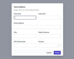
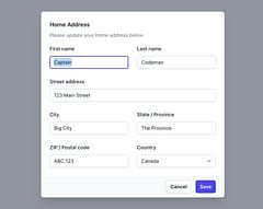
<Modal bind:this="{modal}" onclose="{cancel}">
<div class="mt-3 text-center sm:mt-0 sm:text-left">
<h3 class="text-base font-semibold leading-6 text-gray-900" id="modal-title">Home Address</h3>
<div class="mt-2">
<p class="text-sm text-gray-500">Please {mode === 'create' ? 'enter' : 'update'} your home address below</p>
</div>
</div>
<div class="mt-4 mb-2">
<DetailsForm bind:details />
</div>
{#snippet commands()}
<button
type="button"
class="inline-flex w-full justify-center rounded-md px-3 py-2 text-sm font-semibold text-white shadow-sm sm:ml-3 sm:w-auto bg-indigo-600 hover:bg-indigo-500"
onclick="{save}"
>
{mode === 'create' ? 'Create' : 'Save'}
</button>
<button
type="button"
class="mt-3 inline-flex w-full justify-center rounded-md bg-white px-3 py-2 text-sm font-semibold text-gray-900 shadow-sm ring-1 ring-inset ring-gray-300 hover:bg-gray-50 sm:mt-0 sm:w-auto"
onclick="{cancel}"
>
Cancel
</button>
{/snippet}
</Modal>The caller can use create or edit as appropriate which clones the object (to prevent edits from mutating the original object) and returns a promise that the caller can await for the result. An alternative would be to always pass the mode plus an object to edit, putting the responsibility on the caller to manage cloning it, but I think this encapsulates things nicely. The mode is useful to adjust the prompt message and the confirmation button to better reflect what is being done.
Similar to the other dialogs, we will import it and bind an instance, but all interaction with it is now done programatically:
<script lang="ts">
  import DetailsModal from '$lib/DetailsModal.svelte'

  let detailsModal: DetailsModal

  let details = $state<Details>({
    given_name: 'Captain',
    family_name: 'Codeman',
    street_address: '123 Main Street',
    city: 'Big City',
    region: 'The Province',
    postal_code: 'ABC 123',
    country: 'CA',
  })

  let message = $state('')
<script>

<DetailsModal bind:this={detailsModal} />
Create
Creating a new entry would look like this:
async function create() {
  try {
    message = ''
    details = await detailsModal.create()
    message = 'Details created'
  } catch {
    message = 'Create cancelled'
  }
}
Edit
Editing an existing entry would look like this:
async function edit() {
  try {
    message = ''
    details = await detailsModal.edit(details)
    message = 'Details updated'
  } catch {
    message = 'Edit cancelled'
  }
}
In case you’re wondering, the address input form itself is nothing special, it’s simply bound inputs with whatever styling and validation is required.
/lib/DetailsForm.svelte
<script lang="ts">
  import type { Details } from './details'

  let { details = $bindable() }: { details: Details } = $props()
</script>

<div class="grid max-w-2xl grid-cols-1 gap-x-6 gap-y-6 sm:grid-cols-6 md:col-span-2">
  <div class="sm:col-span-3">
    <label for="first-name" class="block text-sm font-medium leading-6 text-gray-900">First name</label>
    <div class="mt-2">
      <input
        type="text"
        name="first-name"
        id="first-name"
        autocomplete="given-name"
        class="block w-full rounded-md border-0 py-1.5 text-gray-900 shadow-sm ring-1 ring-inset ring-gray-300 placeholder:text-gray-400 focus:ring-2 focus:ring-inset focus:ring-indigo-600 sm:text-sm sm:leading-6"
        data-1p-ignore
        bind:value="{details.given_name}"
      />
    </div>
  </div>

  <div class="sm:col-span-3">
    <label for="last-name" class="block text-sm font-medium leading-6 text-gray-900">Last name</label>
    <div class="mt-2">
      <input
        type="text"
        name="last-name"
        id="last-name"
        autocomplete="family-name"
        class="block w-full rounded-md border-0 py-1.5 text-gray-900 shadow-sm ring-1 ring-inset ring-gray-300 placeholder:text-gray-400 focus:ring-2 focus:ring-inset focus:ring-indigo-600 sm:text-sm sm:leading-6"
        data-1p-ignore
        bind:value="{details.family_name}"
      />
    </div>
  </div>

  <div class="col-span-full">
    <label for="street-address" class="block text-sm font-medium leading-6 text-gray-900">Street address</label>
    <div class="mt-2">
      <input
        type="text"
        name="street-address"
        id="street-address"
        autocomplete="street-address"
        class="block w-full rounded-md border-0 py-1.5 text-gray-900 shadow-sm ring-1 ring-inset ring-gray-300 placeholder:text-gray-400 focus:ring-2 focus:ring-inset focus:ring-indigo-600 sm:text-sm sm:leading-6"
        data-1p-ignore
        bind:value="{details.street_address}"
      />
    </div>
  </div>

  <div class="sm:col-span-3 sm:col-start-1">
    <label for="city" class="block text-sm font-medium leading-6 text-gray-900">City</label>
    <div class="mt-2">
      <input
        type="text"
        name="city"
        id="city"
        autocomplete="address-level2"
        class="block w-full rounded-md border-0 py-1.5 text-gray-900 shadow-sm ring-1 ring-inset ring-gray-300 placeholder:text-gray-400 focus:ring-2 focus:ring-inset focus:ring-indigo-600 sm:text-sm sm:leading-6"
        data-1p-ignore
        bind:value="{details.city}"
      />
    </div>
  </div>

  <div class="sm:col-span-3">
    <label for="region" class="block text-sm font-medium leading-6 text-gray-900">State / Province</label>
    <div class="mt-2">
      <input
        type="text"
        name="region"
        id="region"
        autocomplete="address-level1"
        class="block w-full rounded-md border-0 py-1.5 text-gray-900 shadow-sm ring-1 ring-inset ring-gray-300 placeholder:text-gray-400 focus:ring-2 focus:ring-inset focus:ring-indigo-600 sm:text-sm sm:leading-6"
        data-1p-ignore
        bind:value="{details.region}"
      />
    </div>
  </div>

  <div class="sm:col-span-3">
    <label for="postal-code" class="block text-sm font-medium leading-6 text-gray-900">ZIP / Postal code</label>
    <div class="mt-2">
      <input
        type="text"
        name="postal-code"
        id="postal-code"
        autocomplete="postal-code"
        class="block w-full rounded-md border-0 py-1.5 text-gray-900 shadow-sm ring-1 ring-inset ring-gray-300 placeholder:text-gray-400 focus:ring-2 focus:ring-inset focus:ring-indigo-600 sm:text-sm sm:leading-6"
        data-1p-ignore
        bind:value="{details.postal_code}"
      />
    </div>
  </div>

  <div class="sm:col-span-3">
    <label for="country" class="block text-sm font-medium leading-6 text-gray-900">Country</label>
    <div class="mt-2">
      <select
        id="country"
        name="country"
        autocomplete="country-name"
        class="block w-full rounded-md border-0 py-1.5 text-gray-900 shadow-sm ring-1 ring-inset ring-gray-300 focus:ring-2 focus:ring-inset focus:ring-indigo-600 sm:max-w-xs sm:text-sm sm:leading-6"
        bind:value="{details.country}"
      >
        <option value="CA">Canada</option>
        <option value="GB">United Kingdom</option>
        <option value="MX">Mexico</option>
        <option value="US">United States</option>
      </select>
    </div>
  </div>
</div>
Toast Notifications
That’s usually how I approach dialogs and creating other types of popups such as toast notifications aren’t too dissimilar either. I’ll try to create an article on those at some point.