HeadlessUI Components with Svelte
An efficient Svelte-first approach
Contents
- Introduction
- The Styling Challenge
- Headless / Renderless Approach
- Unofficial Port for Svelte
- Make It Sveltier!
- How It Works
- Code Implementation
- End Results
- Update - Package Now Available
Introduction
Creating apps with any modern web framework is all about using components. They are the building blocks for most application UI. In an ideal world we’d be able to re-use components again and again in different projects and there are many component libraries that aim to provide just that. Unfortunately, in the real world things aren’t always quite so straightforward. If we’re using anything but the out-the-box design our components come with, we likely want to customize them. Again, component libraries often provide ways to do this, allowing you to add your own styling either by customizing the CSS, applying properties or setting CSS variables. But the styling is typically limited to what that component “is”. A button is a button, and at most might contain an icon, but it’s rarely going to change much markup-wise, which makes styling it relatively straightforward (although still surprisingly challenging at times!)
The Styling Challenge
At some point we create larger building blocks, richer components that are themselves comprised of the smaller building blocks. Making these stylable then becomes more challenging than when we were using the smaller pieces directly. It’s also more likely at this stage that we want to be going beyond styling and changing what the components render based on what our app needs to show.
Take a drop-down list for example. It is really a button, to display the current value and to toggle the list visibility, and the list. But while a basic list might contain just plain text, in our app we may want to include an icon, or a status, or both, or a name and a curency value or … or … the possibilities are endless. After all, there’s a reason that we’re not simply using the browsers native <select> component - because we don’t have the freedom to style it exactly as we want including customizing what it contains.
At this point, most people reach for “slots”, most frameworks provide some kind of “wrap these components with this component” functionality to re-use behavior and allow for more markup flexibility. But does it work? Where are the easy-to-use components that are truly flexible? They are hard to find, and it’s frustrating to discover a component that works great but that you can’t style, or an easily stylable one that doesn’t behave correctly. And “behave correctly” goes beyond simply the visuals - it’s all the aria accessibility and keyboard support that we take for granted with native browser elements. So what is the answer?
Headless / Renderless Approach
One approach that several people have come up with is known by various names: renderlesss components, headless components and so on. The approach always boils down to the same thing - allow you to bring the markup and styling, the parts you want to customize for your app, and the component will provide the behavior which is often the time-consuming piece to implement correctlty but that should be re-usable and standardized between apps.
Tailwind, creators of the popular TailwindCSS utility-first CSS framework, have created their own HeadlessUI library which is a wonderful addition to use with their TailwindUI suite of read-made component snippets. It turns the HTML markup and CSS class templates into fully working components that you can customize … well, you can if you are using either the React or Vue frameworks that they support.
Unofficial Port for Svelte
If you’re using Svelte? Well, you have two options. Take the HTML + CSS templates from TailwindUI and build your own components, or use an unofficial port created for Svelte. I’ve previously developed my own components to try to re-use them across apps, and explored various approaches to this before I came across @rgossiaux/svelte-headlessui. It looks like a fine piece of work, and you should definitely check it out, it just isn’t for me for two reasons:
- I don’t like the wrapper-Component approach. Usually I’m starting with a chunk of HTML and CSS and want to add the behavior, and having to change things into components adds more work than I want to do (this isn’t a fault of the package, it’s the approach that the other framework versions use which it is mirroring).
- I believe this approach results in a larger JS bundle size, more than I expected or wanted (specifics at the end).
Let’s take this HeadlessUI Menu component as an example:
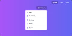
This is the code for the Vue version:
<template>
  <div class="w-56 text-right fixed top-16">
    <Menu as="div" class="relative inline-block text-left">
      <div>
        <MenuButton
          class="inline-flex justify-center w-full px-4 py-2 text-sm font-medium text-white bg-black rounded-md bg-opacity-20 hover:bg-opacity-30 focus:outline-none focus-visible:ring-2 focus-visible:ring-white focus-visible:ring-opacity-75"
        >
          Options
          <ChevronDownIcon
            class="w-5 h-5 ml-2 -mr-1 text-violet-200 hover:text-violet-100"
            aria-hidden="true"
          />
        </MenuButton>
      </div>

      <transition
        enter-active-class="transition duration-100 ease-out"
        enter-from-class="transform scale-95 opacity-0"
        enter-to-class="transform scale-100 opacity-100"
        leave-active-class="transition duration-75 ease-in"
        leave-from-class="transform scale-100 opacity-100"
        leave-to-class="transform scale-95 opacity-0"
      >
        <MenuItems
          class="absolute right-0 w-56 mt-2 origin-top-right bg-white divide-y divide-gray-100 rounded-md shadow-lg ring-1 ring-black ring-opacity-5 focus:outline-none"
        >
          <div class="px-1 py-1">
            <MenuItem v-slot="{ active }">
              <button
                :class="[
                  active ? 'bg-violet-500 text-white' : 'text-gray-900',
                  'group flex rounded-md items-center w-full px-2 py-2 text-sm',
                ]"
              >
                <EditIcon
                  :active="active"
                  class="w-5 h-5 mr-2 text-violet-400"
                  aria-hidden="true"
                />
                Edit
              </button>
            </MenuItem>
            <MenuItem v-slot="{ active }">
              <button
                :class="[
                  active ? 'bg-violet-500 text-white' : 'text-gray-900',
                  'group flex rounded-md items-center w-full px-2 py-2 text-sm',
                ]"
              >
                <DuplicateIcon
                  :active="active"
                  class="w-5 h-5 mr-2 text-violet-400"
                  aria-hidden="true"
                />
                Duplicate
              </button>
            </MenuItem>
          </div>
          <div class="px-1 py-1">
            <MenuItem v-slot="{ active }">
              <button
                :class="[
                  active ? 'bg-violet-500 text-white' : 'text-gray-900',
                  'group flex rounded-md items-center w-full px-2 py-2 text-sm',
                ]"
              >
                <ArchiveIcon
                  :active="active"
                  class="w-5 h-5 mr-2 text-violet-400"
                  aria-hidden="true"
                />
                Archive
              </button>
            </MenuItem>
            <MenuItem v-slot="{ active }">
              <button
                :class="[
                  active ? 'bg-violet-500 text-white' : 'text-gray-900',
                  'group flex rounded-md items-center w-full px-2 py-2 text-sm',
                ]"
              >
                <MoveIcon
                  :active="active"
                  class="w-5 h-5 mr-2 text-violet-400"
                  aria-hidden="true"
                />
                Move
              </button>
            </MenuItem>
          </div>

          <div class="px-1 py-1">
            <MenuItem v-slot="{ active }">
              <button
                :class="[
                  active ? 'bg-violet-500 text-white' : 'text-gray-900',
                  'group flex rounded-md items-center w-full px-2 py-2 text-sm',
                ]"
              >
                <DeleteIcon
                  :active="active"
                  class="w-5 h-5 mr-2 text-violet-400"
                  aria-hidden="true"
                />
                Delete
              </button>
            </MenuItem>
          </div>
        </MenuItems>
      </transition>
    </Menu>
  </div>
</template>

<script setup>
import { Menu, MenuButton, MenuItems, MenuItem } from '@headlessui/vue'
import { ChevronDownIcon } from '@heroicons/vue/solid'
import ArchiveIcon from './archive-icon.vue'
import DuplicateIcon from './duplicate-icon.vue'
import MoveIcon from './move-icon.vue'
import EditIcon from './edit-icon.vue'
import DeleteIcon from './delete-icon.vue'
</script>
Make It Sveltier!
If I wanted to remove the components, and keep something closer to the original HTML / CSS template, I’d like to write something like this instead:
<script lang="ts">
  import { Transition } from 'svelte-transition'
  import { createMenu } from '@headlessui/svelte' // not a thing!

  const { model, button, items, item } = createMenu()
</script>

<div class="w-56 text-right fixed top-16">
  <div class="relative inline-block text-left">
    <button class="inline-flex justify-center w-full px-4 py-2 text-sm font-medium text-white bg-black rounded-md bg-opacity-20 hover:bg-opacity-30 focus:outline-none focus-visible:ring-2 focus-visible:ring-white focus-visible:ring-opacity-75" use:button>
      Options
      <!-- heroicons chevron-down -->
      <svg class="w-5 h-5 ml-2 -mr-1 text-violet-200 hover:text-violet-100" fill="none" viewBox="0 0 24 24" stroke="currentColor" stroke-width="2">
        <path stroke-linecap="round" stroke-linejoin="round" d="M19 9l-7 7-7-7" />
      </svg>
    </button>
    <Transition
      show={$model.show}
      enter="transition ease-out duration-100"
      enterFrom="transform opacity-0 scale-95"
      enterTo="transform opacity-100 scale-100"
      leave="transition ease-in duration-75"
      leaveFrom="transform opacity-100 scale-100"
      leaveTo="transform opacity-0 scale-95"
    >
      <div class="absolute right-0 w-56 mt-2 origin-top-right bg-white divide-y divide-gray-100 rounded-md shadow-lg ring-1 ring-black ring-opacity-5 focus:outline-none items" use:items>
        <div class="px-1 py-1">
          <button class="group flex rounded-md items-center w-full px-2 py-2 text-sm"
            class:active={$model.active === 'edit'}
            use:item={'edit'}
          >
            <svg viewBox="0 0 20 20" fill="none" aria-hidden="true">
              <path d="M4 13V16H7L16 7L13 4L4 13Z" stroke-width="2" />
            </svg>
            Edit
          </button>
          <button class="group flex rounded-md items-center w-full px-2 py-2 text-sm"
            class:active={$model.active === 'duplicate'}
            use:item={'duplicate'}
          >
            <svg viewBox="0 0 20 20" fill="none" aria-hidden="true">
              <path d="M4 4H12V12H4V4Z" stroke-width="2"/>
              <path d="M8 8H16V16H8V8Z" stroke-width="2" />
            </svg>
            Duplicate
          </button>
        </div>
        <div class="px-1 py-1">
          <button class="group flex rounded-md items-center w-full px-2 py-2 text-sm"
            class:active={$model.active === 'archive'}
            use:item={'archive'}
          >
            <svg viewBox="0 0 20 20" fill="none" aria-hidden="true">
              <rect x="5" y="8" width="10" height="8" stroke-width="2" />
              <rect x="4" y="4" width="12" height="4" stroke-width="2" />
              <path d="M8 12H12" stroke="#A78BFA" stroke-width="2" />
            </svg>
            Archive
          </button>
          <button class="group flex rounded-md items-center w-full px-2 py-2 text-sm"
            class:active={$model.active === 'move'}
            use:item={'move'}
          >
            <svg viewBox="0 0 20 20" fill="none" aria-hidden="true">
              <path d="M10 4H16V10" stroke-width="2" />
              <path d="M16 4L8 12" stroke-width="2" />
              <path d="M8 6H4V16H14V12" stroke-width="2" />
            </svg>
            Move
          </button>
        </div>
        <div class="px-1 py-1">
          <button class="group flex rounded-md items-center w-full px-2 py-2 text-sm"
            class:active={$model.active === 'delete'}
            use:item={'delete'}
          >
            <svg viewBox="0 0 20 20" fill="none" aria-hidden="true">
              <rect x="5" y="6" width="10" height="10" stroke-width="2" />
              <path d="M3 6H17" stroke-width="2" />
              <path d="M8 6V4H12V6" stroke-width="2" />
            </svg>
            Delete
          </button>
        </div>
      </div>
    </Transition>
  </div>
</div>

<style lang="postcss">
  .items button {
    @apply text-gray-900;
  }

  .items button.active {
    @apply bg-violet-500 text-white;
  }

  .items button svg {
    @apply w-5 h-5 mr-2;
  }

  .items button path,
  .items button rect {
    fill: #EDE9FE;
    stroke: #A78BFA;
  }

  .items button.active path,
  .items button.active rect {
    fill: #8B5CF6;
    stroke: #C4B5FD;
  }
</style>
This is mostly just applying some Svelte class toggles, and applying the use:action directives to selected elements. For me, that is easier to do than converting things into the components.
How It Works
So what’s going on and how does it work?
The important thing for us is almost the least noticeable, but cleaning it all up should hopefully help to make it more obvious. The first thing you’ll notice is that all those wrapper classes are gone. We’re working with something much closer to the HTML markup we may get from a designer and applying classes to it. We already have all the elements we need, no need to create more. This is all using standard Svelte template code, which is easy to read and simple to write, it’s small and fast.
The “secret sauce” is the addition of use:action directives applied to certain HTML elements. This is a Svelte feature that allow you to attach behavior to DOM elements. A side effect is that they only run client-side, which is perfect, because that is where all our user-DOM interaction happens! So our components are fully SSR compliant.
These actions are functions that are passed a reference to the node they are defined on plus any parameters that are set. Some, like the button and list don’t take any parameters, they just need to set DOM properties on the nodes they control based on the state model of the component. Others, the option’s are passed the value to set on the state model when that option is active. These actions don’t really care what element they are defined on, we could use a <button> or a <div> or <ul> and <li> items for the menu options, whatever makes sense to our app, what they are going to do is update appropriate DOM properties for us, typically the aria- tags for accessibility. They will also update the model which is a Svelte store that our elements use to determine if the drop-down list should be shown or not, and if an option should be styled as active or not.
But how does the use:list action know to set the aria-activedescendent property on it’s element when someone hovers their mouse over an option element or changes the active option using the keyboard? How is that communication happening?
Well notice that we import a createMenu function, this is a factory function that returns the model state as a Svelte store plus the use:action functions that are wired up to share state behind the scenes because they share the same closure scope. They can reference each other and attach whatever event listeners are needed, and update the state model as necessary based on what interactions take place. The model, because it is a Svelte store, provides the reactivity required for the template to update itself as required.
Note the Transition element is something I released earlier as svelte-transition. The reason it’s a separate package is that I was initially using it to apply transitions to the TailwindUI components, and the existing svelte implementations weren’t very Tailwind friendly in that their parameters didn’t align with those in the React and Vue templates or the comments in the vanilla HTML templates. It’s the only thing that uses <slot> to wrap other elements.
Code Implementation
This isn’t a fully complerte implementation, but hopefully demonstrates the key parts of the approach:
import { writable } from "svelte/store"

// these are simple utility functions and enums
// copied from the HeadlessUI implementation
import { Keys } from "./keys"
import { useId } from './use-id'
import { keyup } from "./keyup"

export function createMenu() {
  // state of our control
  const state = { show: false, active: '', activeIndex: -1, search: '' }

  // generated IDs for components
  const button_id = `headlessui-menu-button-${useId()}`
  const items_id = `headlessui-menu-items-${useId()}`

  // array to contain the options we'll build up
  const options = []

  // svelte store for state, to make it reactive
  const { subscribe, set } = writable(state)

  // element references
  let button_ref: HTMLElement
  let items_ref: HTMLElement

  // open the list, selecting an item if passed
  async function open(index = -1) {
    state.show = true
    select(index)
    requestAnimationFrame(() => items_ref.focus())
  }

  // close the list
  async function close() {
    state.show = false
    set(state)
    button_ref.focus({ preventScroll: true })
  }

  // select an item
  async function select(index) {
    if (index === -1) {
      state.activeIndex = index
      state.active = ''
      items_ref.setAttribute('aria-activedescendant', undefined)
    } else {
      const option = options[index]
      state.activeIndex = index
      state.active = option.value
      items_ref.setAttribute('aria-activedescendant', option.node.id)
    }
    set(state)
  }

  // use:action for button
  function button(node: HTMLElement) {
    button_ref = node
    node.id = button_id

    // set aria properties
    node.ariaHasPopup = 'true'
    node.ariaExpanded = undefined
    node.setAttribute('aria-controls', '')

    function keydown(event) {
      switch (event.key) {
        // Ref: https://www.w3.org/TR/wai-aria-practices-1.2/#keyboard-interaction-13

        case Keys.Space:
        case Keys.Enter:
        case Keys.ArrowDown:
          event.preventDefault()
          event.stopPropagation()
          open(0)
          break

        case Keys.ArrowUp:
          event.preventDefault()
          event.stopPropagation()
          open(options.length - 1)
          break
      }
    }

    function click(event) {
      if (node.getAttribute('disable') === '') return event.preventDefault()
      if (state.show) {
        close()
      } else {
        open()
      }
    }

    node.addEventListener('keydown', keydown)
    node.addEventListener('keyup', keyup)
    node.addEventListener('click', click)

    return {
      destroy() {
        node.removeEventListener('keydown', keydown)
        node.removeEventListener('keyup', keyup)
        node.removeEventListener('click', click)
      }
    }
  }

  // use action for items list
  function items(node: HTMLElement) {
    items_ref = node
    node.id = items_id
    node.tabIndex = 0
    node.setAttribute('role', 'menu')
    node.setAttribute('aria-activedescendant', undefined)
    node.setAttribute('aria-labelledby', button_id)
    // TODO: update aria-controls on button now list is known

    function keydown(event) {
      switch (event.key) {
        // Ref: https://www.w3.org/TR/wai-aria-practices-1.2/#keyboard-interaction-12

        // TODO: handle typeahead
        case Keys.Space:
        case Keys.Enter:
          break

        case Keys.ArrowDown:
          event.preventDefault()
          event.stopPropagation()
          return state.activeIndex < options.length - 1 && select(state.activeIndex + 1)

        case Keys.ArrowUp:
          event.preventDefault()
          event.stopPropagation()
          return state.activeIndex && select(state.activeIndex - 1)

        case Keys.Home:
        case Keys.PageUp:
          event.preventDefault()
          event.stopPropagation()
          return select(0)

        case Keys.End:
        case Keys.PageDown:
          event.preventDefault()
          event.stopPropagation()
          return select(options.length - 1)

        case Keys.Escape:
          event.preventDefault()
          event.stopPropagation()
          close()
          break

        case Keys.Tab:
          event.preventDefault()
          event.stopPropagation()
          break

        default:
          if (event.key.length === 1) {
            // TODO: handle typeahead
            // set timeout to clear 350ms
          }
          break
      }
    }

    function click() {
      close()
    }

    node.addEventListener('keydown', keydown)
    node.addEventListener('keyup', keyup)
    node.addEventListener('click', click)

    return {
      destroy() {
        node.removeEventListener('keydown', keydown)
        node.removeEventListener('keyup', keyup)
        node.removeEventListener('click', click)
      }
    }
  }

  // use:action for item option
  function item(node: HTMLElement, value: string) {
    options.push({ node, value })

    const disabled = node.hasAttribute('disabled')

    node.id = `headlessui-menu-item-${useId()}`
    node.tabIndex = disabled ? undefined : -1
    node.ariaDisabled = disabled ? 'true' : undefined
    node.setAttribute('role', 'menuitem')

    function mouseenter() {
      const index = options.findIndex(option => option.node === node)
      select(index)
    }

    node.addEventListener('mouseenter', mouseenter)

    return {
      destroy() {
        node.removeEventListener('mouseenter', mouseenter)
      }
    }
  }

  return {
    // make model store read-only to component
    model: { subscribe },
    button,
    items,
    item,
  }
}
Effectively it’s simple use:action functions, combined with a store for reactivity in the template, but all created from a factory function so they can communicate with each other and share state.
End Results
What are the final results like? Does it simply save a few bytes of source code?
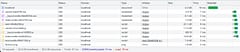
Here’s some early results using this exact menu control as an example. Both of these were created in the exact same way, initializing a new SvelteKit project, installing the appropriate dependencies plus TailwindCSS using the Svelte Adder for Tailwind. The example control was then put into the route index.svelte file and the project built and run using:
pnpm run build
pnpm run preview
But note that this is absolutely NOT REALLY A FAIR TEST. Look, I wrote that all bold and everything … I’ll explain why in the conclusion.
@rgossiaux/svelte-headlessui
Using the existing @rgossiaux/svelte-headlessui unofficial port
The index page is 11.56KiB and the vendor chunk 76.64KiB

The total transferred at runtime in the browser is 128kB
Svelte use:action Approach
Using this “Svelte first” approach instead.
The index page is slightly smaller at 10.27KiB and the vendor chunk is now down to only 10.97KiB

The total transferred at runtime in the browser is now just 62.8kB, almost exactly half the size.
In case you’re wondering about the minor CSS differences, this is due to:
- The Transition component which produces the tiny 0.07Kib snippet (which I think I’ll look at inlining)
- My use of
@applyin the component which results in a CSS file for the page (@rgossiauxswitches styles inline using code such asfill={active ? "#8B5CF6" : "#EDE9FE"}). This likely also accounts for the minor difference in the index page JS size too.
So will this halve the size of your app? Unlikely, unless it’s only a few HeadlessUI components! How much you’ll save really depends on how many components you have in your app. But ultimately, if you can reduce the size of your app bundle, the load time of your app should go down and the Lighthouse and Core Web Vitals scores go up. Less JS to do the same thing is always better but it’s a process of finding small wins and combining them. Adding another page with a listbox took the @rgossiaux/svelte-headlessui vendor file to 92.84 KiB which may hint at how much extra JS each control brings vs how much is common / shared code.
Conclusion
I’m happy with this approach. I think it’s clean, efficient and makes good use of Svelte features to produce a Svelte-first solution that is easy to consume.
But of course I’m comparing apples and pears to some degree - as I said earlier it’s not really a fair test. This is an idea for an approach and some snippets of code, it’s not a complete package by any means, the component is really only 90-95% complete and there are no unit tests. But it’s an approach I’ve been successfully using for my own components across apps and I’m going to try to fill out a full implementation for anyone who’s interested in using it.
Update - Package Now Available
Since writing this article, I’ve refined the ideas and implemented a few more components. The re-use keeps the size small so it’s less than 14kB minified / 4.5kB minified gzipped for all of them
Checkout the svelte-headlessui docs / examples or the source repo