Beyond the Polymer Starter Kit: Dialogs and Toolbars
Where to put the pieces as your application grows
Contents
Introduction
The Polymer CLI and Polymer Starter Kit are really fantastic tools for quickly bootstrapping your Progressive Web App development - you get a slick PRPL pattern Single Page App complete with Service Worker and lazy-loading views, all with pretty much zero effort. So simple, so easy.
The simplicity of course makes sense for a starter kit but it can mean that exactly how to implement more advanced features may not be obvious and leave you lost. Once your app starts to grow and you decide you need some views to have their own custom toolbar in the app-header or menu options in the app-drawer for instance, or you just want to use a paper-dialog in some part of the UI - how should you do it?
Does the app-shell (my-app.html) element become cluttered with functionality to pass on toolbar options and state? Is your paper-dialog showing behind the overlay instead of on top of your app and you don’t know why?
As it always seems with web-development, it’s easy to “cobble something together” that seems to work … but isn’t really clean and tidy. Here’s some approaches that I’ve been using.
View-Specific Toolbars
For a simple app. you might have a search icon at the top, on the opposite side to the hamburger menu used to toggle the draw display on mobile devices. When we have a single app-wide toolbar it’s easy, but what if we want to change the toolbar based on the context of the view we’re displaying? Maybe we want to provide some quick options or contextual status display.
Here’s a contrived example showing a random assortment of extra icons:
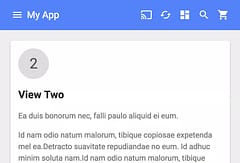
Here’s where they would go in the app shell layout:
<!-- Main content -->
<app-header-layout has-scrolling-region id="layout">
  <app-header id="header" slot="header" condenses reveals effects="waterfall">
    <app-toolbar>
      <paper-icon-button icon="my-icons:menu" drawer-toggle></paper-icon-button>
      <div main-title>My App</div>
      <!-- toolbar icons go here -->
    </app-toolbar>
  </app-header>
What we really don’t want to do is start adding <paper-icon-button> elements in there - instead we should wrap everything in a toolbar element.
Instead of just putting that toolbar element in there though, we can add an iron-pages selector so that we can display the toolbar based on the active page route in the same way that the main page elements are shown and hidden:
<!-- Main content -->
<app-header-layout has-scrolling-region id="layout">
  <app-header id="header" slot="header" condenses reveals effects="waterfall">
    <app-toolbar>
      <paper-icon-button icon="my-icons:menu" drawer-toggle></paper-icon-button>
      <div main-title>My App</div>
      <!-- toolbars -->
      <iron-pages
        selected="[[page]]"
        attr-for-selected="name"
        role="main">
        <my-view1-toolbar name="view1"></my-view1-toolbar>
      </iron-pages>
    </app-toolbar>
  </app-header>
But where should the toolbar be loaded from and how does it communicate with the view it’s associated with?
We’re used to Html Imports being used for individual elements but there’s nothing to stop us from having multiple elements defined in a single file and this makes sense for the toolbar because we want it to be loaded whenever the view is. If we add it to the view then it automatically loads and upgrades the placeholder when the main view is loaded without having to add any additional complexity to the app-shell to keep things in sync or know to load the extra element in PRPL-fashion.
It also means that the classes for the toolbar and the view it’s associated with can communicate directly because they can share the same script block / closure - no need for any DOM Bindings or events. We can use a simplified version that was used to share state between elements separated in the DOM.
I’ve found this a nice pattern to allow any view that needs it to have it’s own toolbar in the app shell and at the same time keep things tidy.
Modal Dialog Boxes
Dialog boxes are a useful UI tool and with mobile now accounting for so much traffic, we’re usually talking about a model dialog to achieve a single ancillary UI task before returning back to our main view as a way to provide a good UI experience with limited screen space.
The first thing we’ll probably try is putting the paper-dialog element in the view where we want to use it. But oh dear, when we open it we might see something like this:
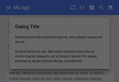
The overlay that’s supposed to darken the view behind the dialog is in front of it, not what we intended.
Why does this happen? Well, it’s all to do with the complexity of stacking layers - the app has multiple layers and some are in front of others and because the dialog is within children within the app-shell elements, it shows behind the overlay.
Here’s what we want to show up instead:
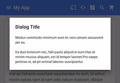
So how difficult is that to achieve? Well, the way to solve it is to move the dialog element so it isn’t contained by the app layout. We could do that dynamically by moving things in the DOM or we can use the same approach as we did for the toolbar - keep the dialog element in the same file as the view that is using it but put it in a different spot in the app shell file.
The view can then open and close the dialog using the exact same techniques as you would to interact with a toolbar (direct references between the view and dialog element, within the same closure), but when it opens the dialog is outside and above the app shell elements so the overlay renders correctly.
I normally put these dialog elements with the <app-route> elements in the shell.
Another option is to use events but I find that using the same approach as for the toolbar makes things simpler and more consistent.
